When you think of Wendy’s, the iconic fast-food chain, what’s the first thing that comes to mind? Maybe it’s their famous square burgers, crispy fries, or even the irresistible Frosty. But for many, it’s the logo—a cheerful red-headed girl with pigtails and freckles. It’s a symbol of comfort food and friendly service that’s been a staple of American culture for decades.
However, there’s more to Wendy’s logo than meets the eye. Hidden within the design is a subtle yet meaningful detail that most people overlook. Once you spot it, you’ll never see the logo the same way again.
Wendy’s Logo: A Nod to Family and Nostalgia

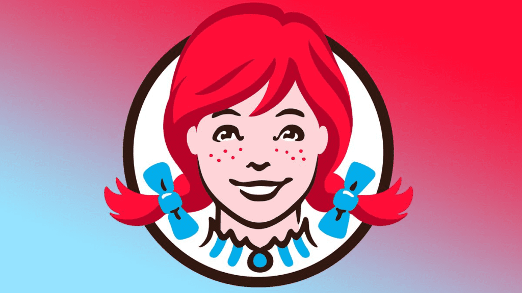
The Wendy’s logo, with its playful design and warm colors, reflects the brand’s family-oriented values. But the deeper meaning lies in the red-headed girl’s collar. If you look closely at the ruffled collar, you’ll notice the word “MOM” subtly spelled out in the folds of the fabric.
This wasn’t a random design choice. The founder of Wendy’s, Dave Thomas, named the restaurant after his daughter, Wendy. He wanted the brand to evoke feelings of home-cooked meals and family gatherings, and embedding “MOM” in the logo was a creative way to reinforce that idea.
Why the Hidden “MOM” Matters
The inclusion of “MOM” in the logo is more than just a clever design trick—it’s a message. It suggests that Wendy’s food is made with the same love and care you’d expect from your mother’s cooking. In the fast-paced world of fast food, where convenience often takes priority, this subtle detail reminds customers that Wendy’s strives to provide meals with a personal touch.
It’s a testament to the brand’s commitment to quality and comfort, setting it apart from competitors. Whether you’re grabbing a quick lunch or indulging in a late-night burger, the “MOM” in the logo serves as a reminder of the homey feel Wendy’s aims to deliver with every meal.
Other Logos with Hidden Messages
Wendy’s isn’t the only brand that uses its logo to tell a story. Many companies incorporate subtle elements into their designs to convey deeper meanings, reflect their values, or celebrate their origins.
Subway: The Arrows of Convenience
Take Subway, for example. Its logo features arrows at the beginning and end of the text, pointing in opposite directions. These arrows symbolize the entrance and exit of a subway station, tying the brand’s name to its emphasis on fast, on-the-go meals. It’s a simple yet effective way to reinforce the concept of convenience.
Toblerone: A Bear in the Mountain
Toblerone, the beloved Swiss chocolate brand, also hides a clever detail in its logo. Within the silhouette of the mountain, you can spot the outline of a bear. This is a nod to the brand’s birthplace, Bern, Switzerland, a city famously associated with bears. It’s a subtle homage to Toblerone’s heritage that adds depth to its branding.

Amazon: Smiling with Purpose
Amazon’s logo, with its arrow stretching from “A” to “Z,” is another iconic example. The arrow doubles as a smile, symbolizing customer satisfaction, while also indicating that Amazon offers everything from A to Z. It’s a straightforward design with a dual message that captures the essence of the brand.
The Power of Hidden Design Details
These hidden elements make logos more than just visual symbols—they turn them into stories. They give brands an opportunity to connect with their audience on a deeper level, making their logos memorable and meaningful.
For Wendy’s, the hidden “MOM” aligns perfectly with the brand’s mission of serving comforting, home-style meals. For customers, discovering this detail adds a sense of delight and reinforces their emotional connection to the brand.
The Evolution of Wendy’s Logo
Over the years, Wendy’s logo has undergone a few changes, but the core elements have remained the same. The red-haired girl, inspired by Dave Thomas’s daughter, continues to be the centerpiece of the design. Each iteration has retained the warm, family-oriented feel that makes Wendy’s stand out in the competitive fast-food industry.
The hidden “MOM” in the collar is a detail that has carried through these updates, emphasizing its importance to the brand’s identity. It’s a small touch that speaks volumes about Wendy’s dedication to its roots and values.
Why Thoughtful Branding Matters

In a world where consumers are bombarded with logos and advertisements every day, thoughtful branding can make all the difference. Logos with hidden meanings or clever design elements create a sense of intrigue and engagement. They encourage customers to look closer, fostering a deeper connection with the brand.
For Wendy’s, the hidden “MOM” isn’t just about being clever—it’s about reminding customers of the love and care that goes into their meals. It’s a detail that makes the brand feel more personal, more intentional, and more relatable.
A Logo That Feels Like Home
The next time you visit Wendy’s or catch a glimpse of their logo, take a moment to appreciate the thought that went into its design. The hidden “MOM” isn’t just a fun Easter egg—it’s a symbol of the brand’s commitment to quality, family, and comfort.
In a fast-paced world, where meals are often about convenience, Wendy’s logo serves as a reminder of what truly matters: warmth, care, and a touch of home. So, whether you’re indulging in a burger or enjoying a Frosty, know that every bite comes with a dash of love—just like mom would make.
Conclusion: A Subtle Detail with a Big Message
The hidden “MOM” in Wendy’s logo may seem like a small detail, but it carries a powerful message. It’s a nod to family, comfort, and the values that define the brand.
Logos like Wendy’s, with their hidden meanings, showcase the power of thoughtful design in creating emotional connections with customers. They remind us that even in the fast-paced world of fast food, there’s room for care, creativity, and heart. So the next time you spot Wendy’s logo, smile—it’s not just a symbol; it’s a story.