Logos Are More Than Just Pretty Designs
Ever looked at a logo and thought, “That’s cool,” but didn’t give it another second of thought? Well, get ready to rethink everything. Logos are more than just fancy artwork or marketing fluff—they’re coded symbols, subtle messages, and tiny puzzles hiding in plain sight. The world’s most recognizable logos often have layers of meaning tucked into their shapes and colors, and most of us never even notice.
So buckle up. We’re about to peel back the curtain on ten everyday logos that hold more secrets than you think.
Amazon and Aang: More in Common Than You’d Expect
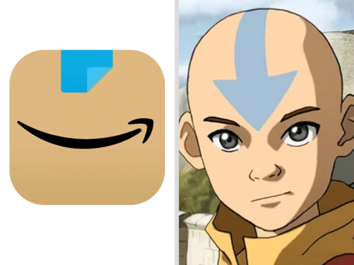
At first glance, the Amazon app icon and Aang from Avatar: The Last Airbender don’t have anything in common—one is a mega shopping platform, the other a fictional teen monk. But visually? There’s some quirky crossover.
Both use minimalist designs, soft curves, and that familiar swooping arrow or mark. Amazon’s arrow goes from A to Z, symbolizing a massive product range and a smile. Aang has that iconic blue arrow pointing down his head, channeling his power as the Avatar. Coincidence? Probably. Still, it’s fun to think of your shopping app channeling some elemental energy.
Video: 16 FAMOUS LOGOS WITH A HIDDEN MEANING (That We Never Even Noticed)
The Face of Uncle Ben? That’s Frank Brown
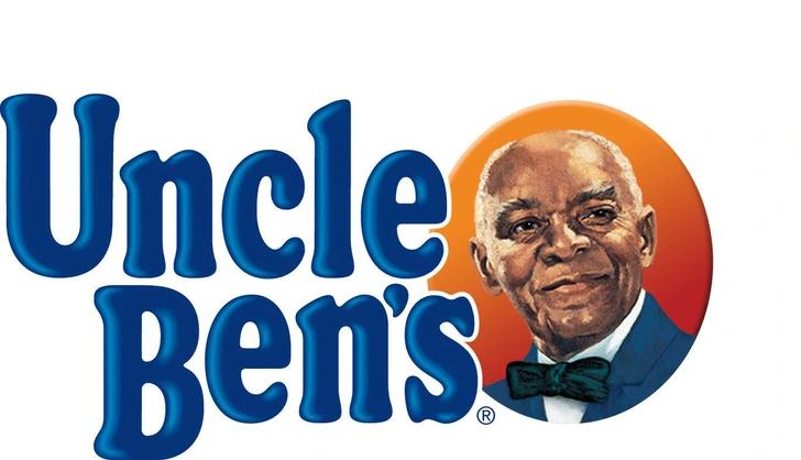
The man behind the smiling face on boxes of parboiled rice wasn’t a random model. His name was Frank Brown, a maître d’ from Chicago. In the 1940s, company execs spotted him at a hotel and thought his dignified appearance captured the essence of quality and tradition. So they made a deal—paying him for the rights to use his face on their brand.
While the brand has evolved over time, that image remains one of the most iconic and debated brand identities in grocery store history.
Tesla’s Logo: Car Company or… Cat Nose?
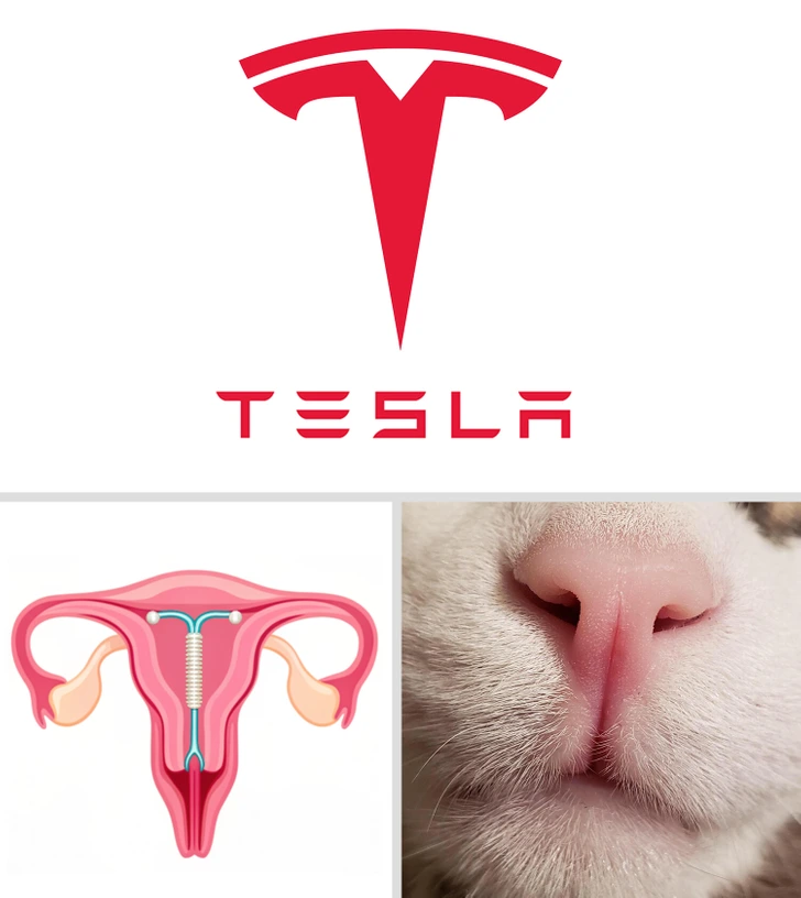
Tesla’s sleek “T” logo screams innovation—but depending on who you ask, it also resembles a birth control device (an IUD) or even a cat’s nose. No joke.
The vertical line with the crossbar mimics the basic IUD shape, while others swear it looks like a feline snout with stylized nostrils. But here’s the actual backstory: the T represents a cross-section of an electric motor. Still, you’ll probably never unsee the cat nose again.
Hershey’s Kiss Hidden in Plain Sight
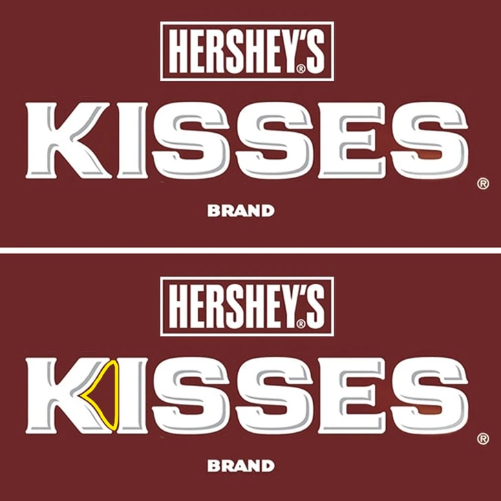
Here’s one that’ll blow your chocolate-loving mind. If you look closely at the Hershey’s Kisses logo, there’s an actual Kiss tucked between the “K” and “I.” Tilt your head sideways and—bam!—there’s the iconic drop-shaped chocolate peeking out.
It’s a genius bit of visual design that adds a playful Easter egg for observant fans.
Quiksilver and The Great Wave
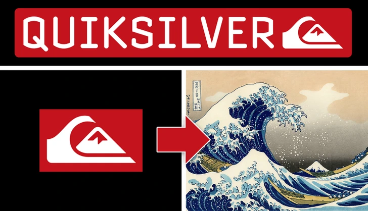
Ever wonder why Quiksilver’s logo—a wave crashing over a mountain—looks like it belongs in a museum? That’s because it’s inspired by a famous painting: The Great Wave off Kanagawa by Japanese artist Hokusai.
In 1973, the founders of the surf brand used this legendary woodblock print to represent the power and unpredictability of the ocean—a perfect match for their surf-centered identity.
Video: 12 Hidden Symbols In Famous Logos You Had No Idea About
Versace’s Medusa: Fashion That Hypnotizes
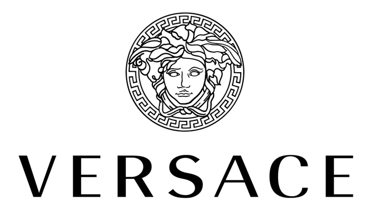
If you’ve ever stared too long at the Versace logo, you’re not alone—it’s designed to have that effect. Created in 1987 by Gianni Versace himself, the logo features Medusa, the mythical figure known for turning people to stone with a single gaze.
Versace loved the idea of creating something so beautiful, it left people spellbound. Medusa wasn’t just about power—she was about enchantment. Exactly what the designer hoped his fashion would do.
Disney’s Logo: That’s Not a Shooting Star
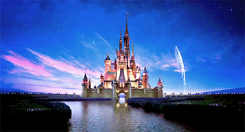
Think that sparkly line sweeping over the castle in Disney movie intros is a shooting star? Think again. It’s actually Tinker Bell leaving a trail of pixie dust.
The castle itself is modeled after Neuschwanstein Castle in Germany, a real-life fairytale fortress owned by King Ludwig II. So next time you watch a Disney classic, remember—you’re seeing a little magic and a bit of European royalty in every intro.
The Laughing Cow: A Logo That Sees Itself
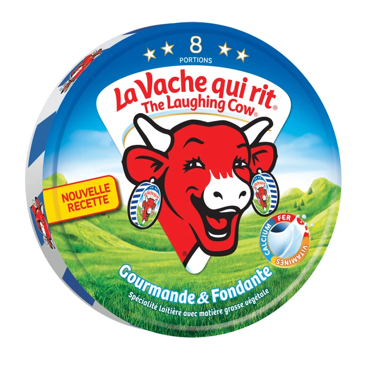
That red-cheeked cow on your cheese snack? She’s wearing earrings shaped like her own logo. Yep—it’s an example of the Droste effect, where an image contains a smaller version of itself, creating an infinite loop.
This mind-bending trick isn’t just cool—it helps The Laughing Cow logo stand out, making it one of the most recognizable food brands in the world.
NASA’s “Meatball” Is Packed With Meaning
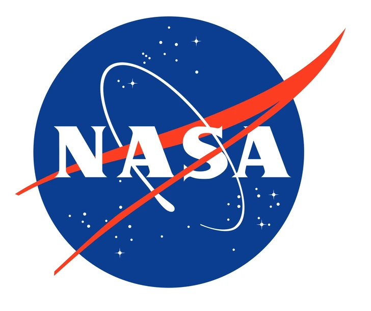
NASA’s round blue logo, affectionately called the “meatball,” is more than just a patriotic patch.
- The blue sphere represents Earth.
- The stars represent space.
- The red wing symbolizes aeronautics and flight.
- And the orbiting spacecraft? That’s exploration, baby.
Designed in 1959 by James Modarelli, this logo brings together everything NASA stands for in one neat, cosmic package.
LUK Oil: A Geography Lesson Hidden in a Name
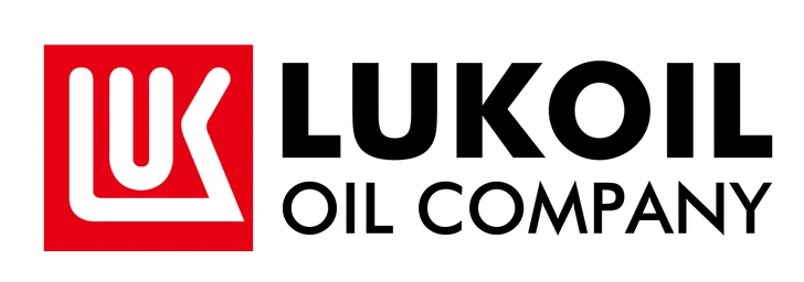
Ever heard of LUK Oil? You might think the name is random, but it’s actually a clever acronym.
It stands for Langepas, Uray, and Kogalym—three oil-producing cities in Russia where the company got its start. Every time you see the LUK logo, you’re looking at a tiny map tribute.
Conclusion: Symbols Hiding in Plain Sight
So the next time you pass a billboard, scroll through your apps, or unwrap a candy bar, take a second look. Logos aren’t just polished designs slapped onto packaging—they’re mini stories. They honor people, hint at origins, and sometimes sneak in clever details just for fun.
From Medusa’s hypnotic stare to a hidden chocolate kiss, these logos prove that great branding goes far beyond the obvious. And now that you know what to look for, you’ll start seeing the world around you in a whole new way. Keep your eyes open—the next surprise might be hiding in plain sight.